BURT'S BEES
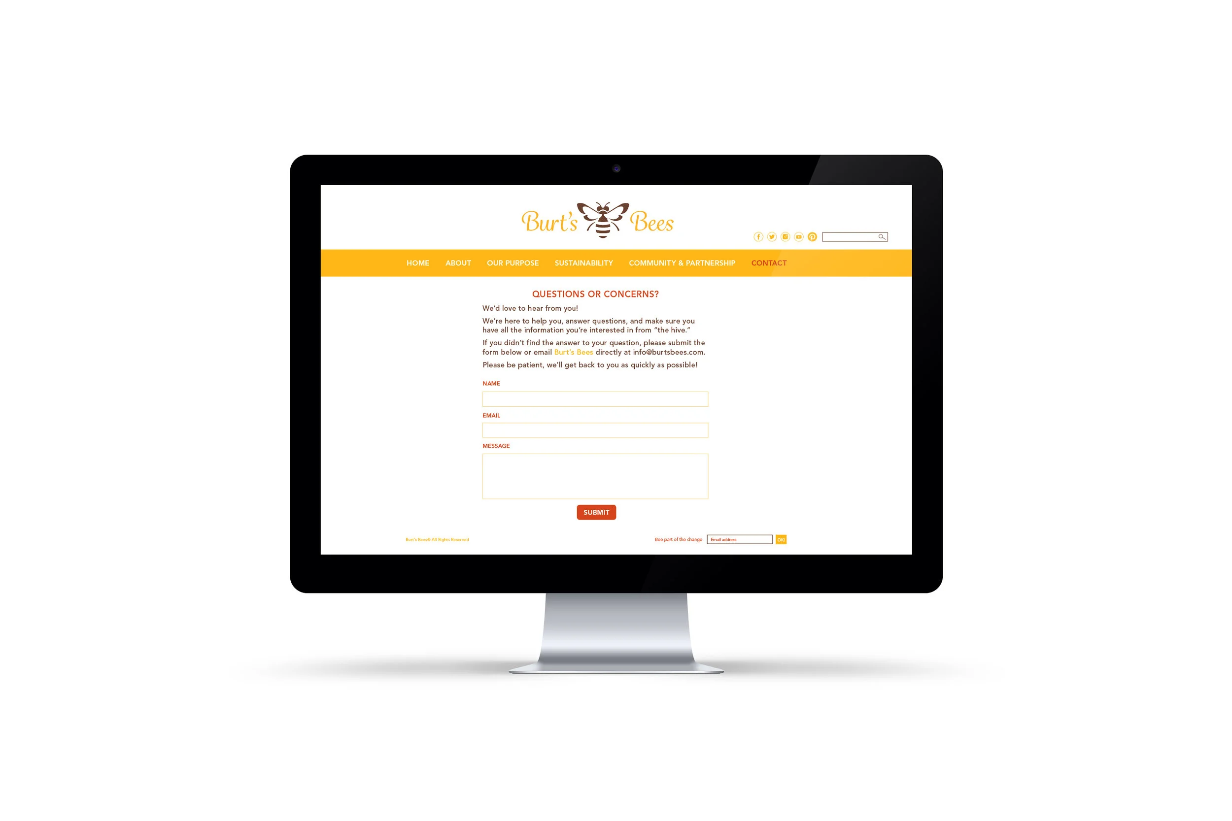
We were tasked with creating a cohesive visual system for a well-known company’s Corporate Social Responsibility (CSR) on various platforms. The twist was to make the new system look and feel like the same company while highlighting its commitment to CSR.
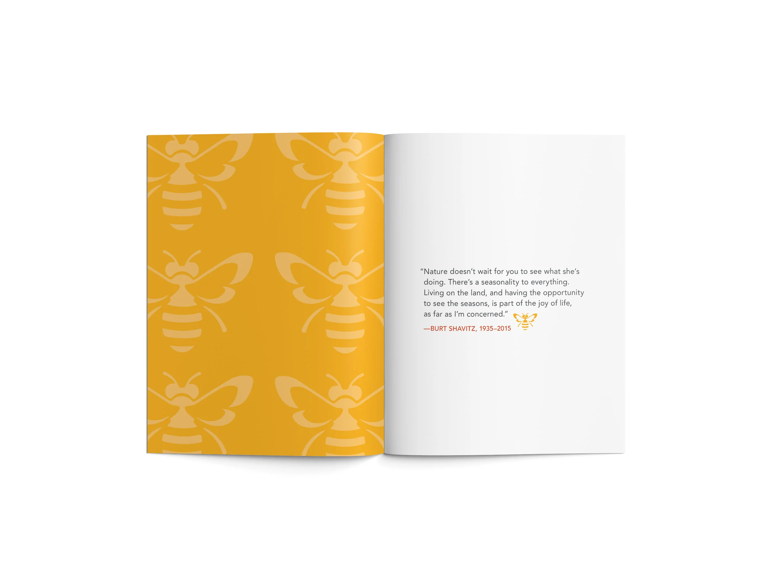
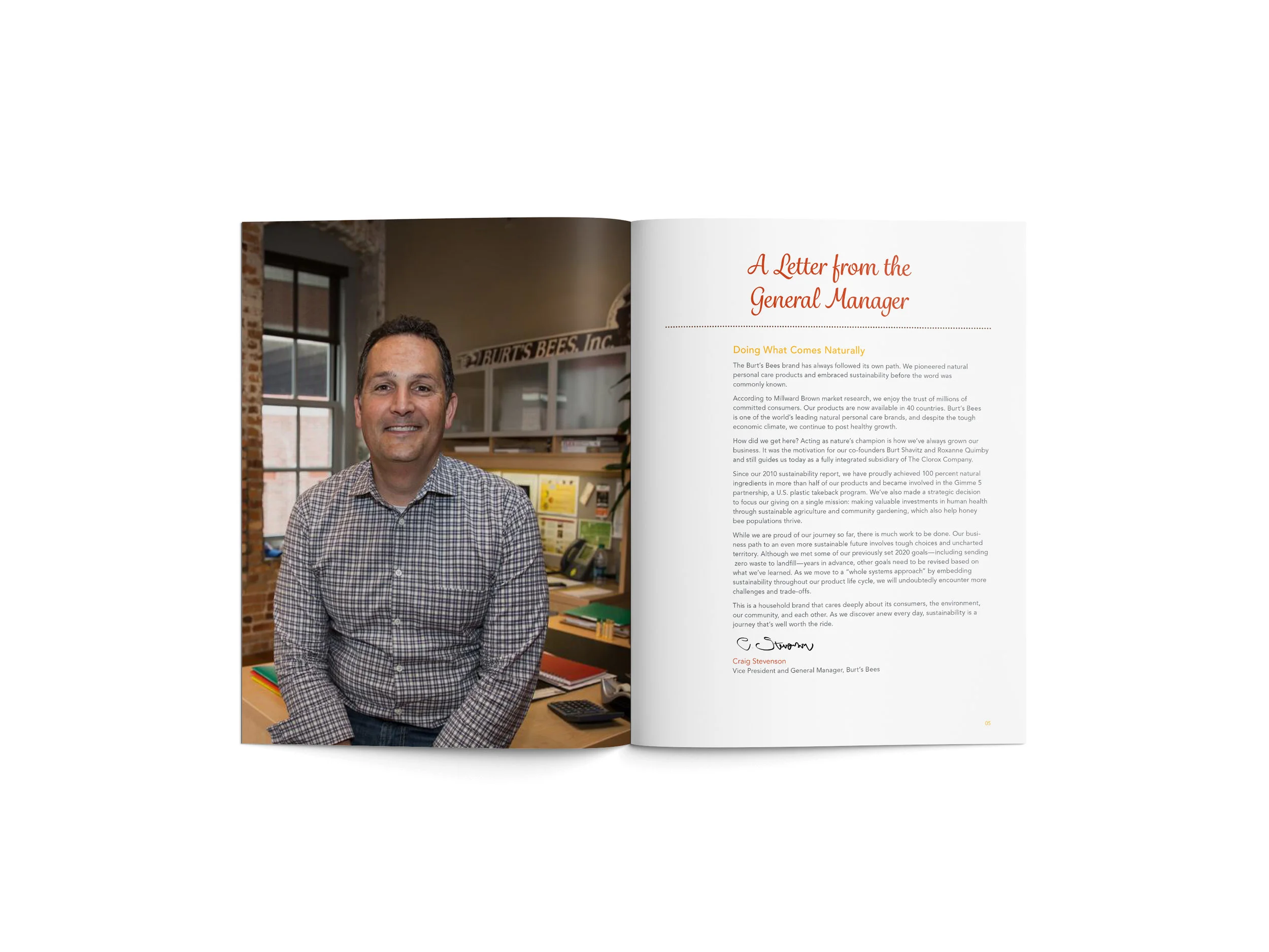
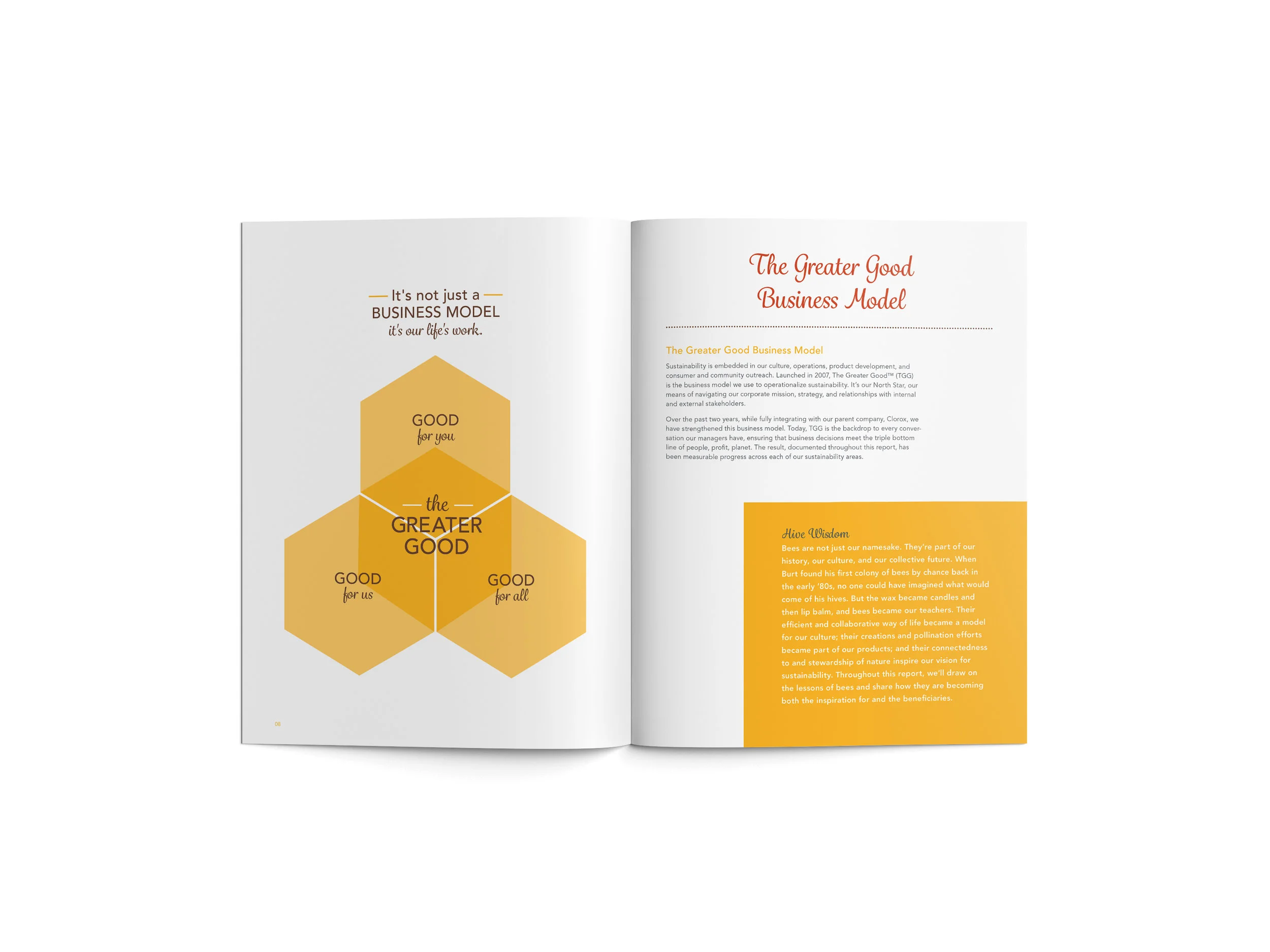
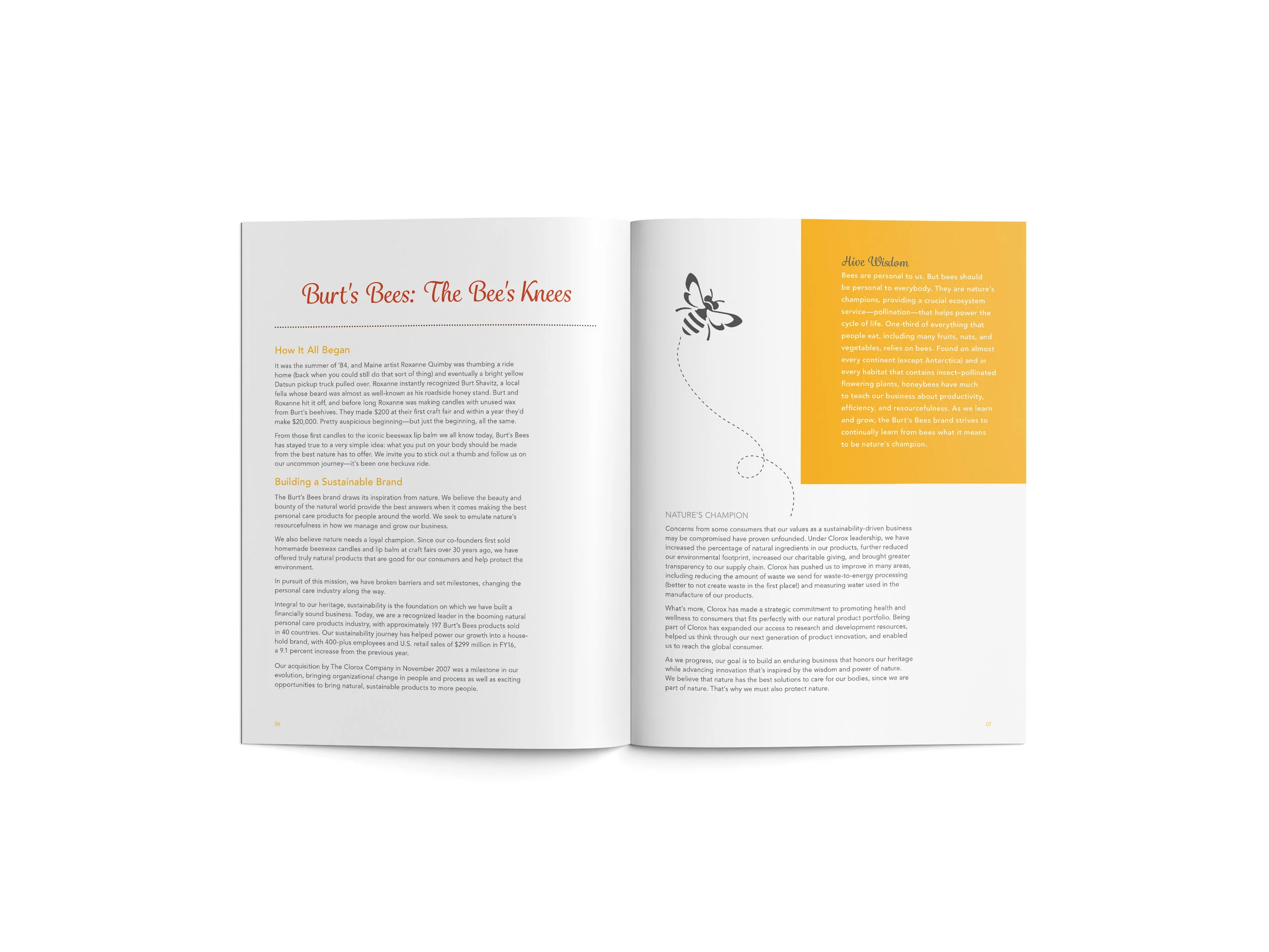
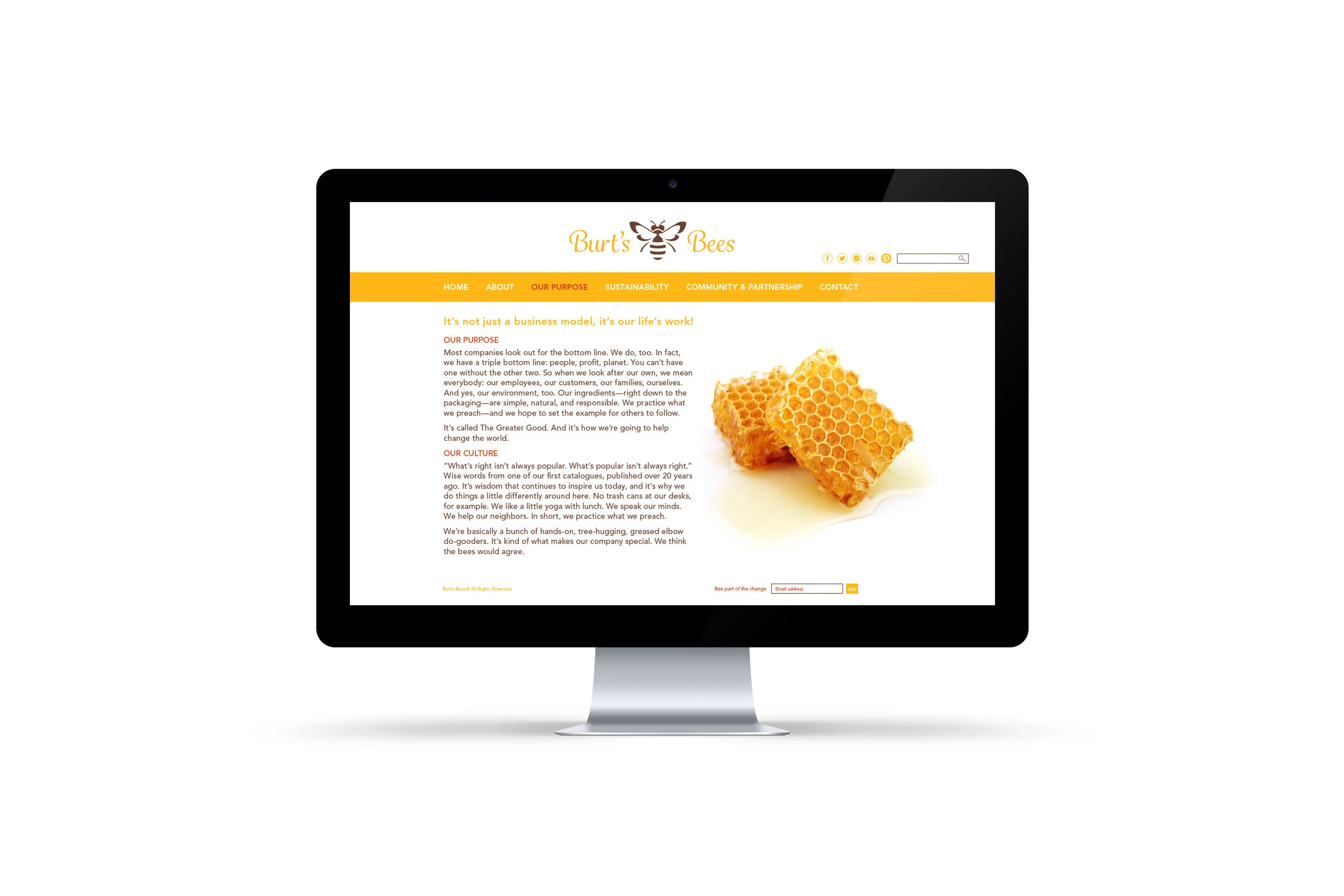
Since I’m brand loyal to Burt’s Bees, I selected them and surprisingly learned a lot about the company and all the wonderful things it does to give back to nature and the community.
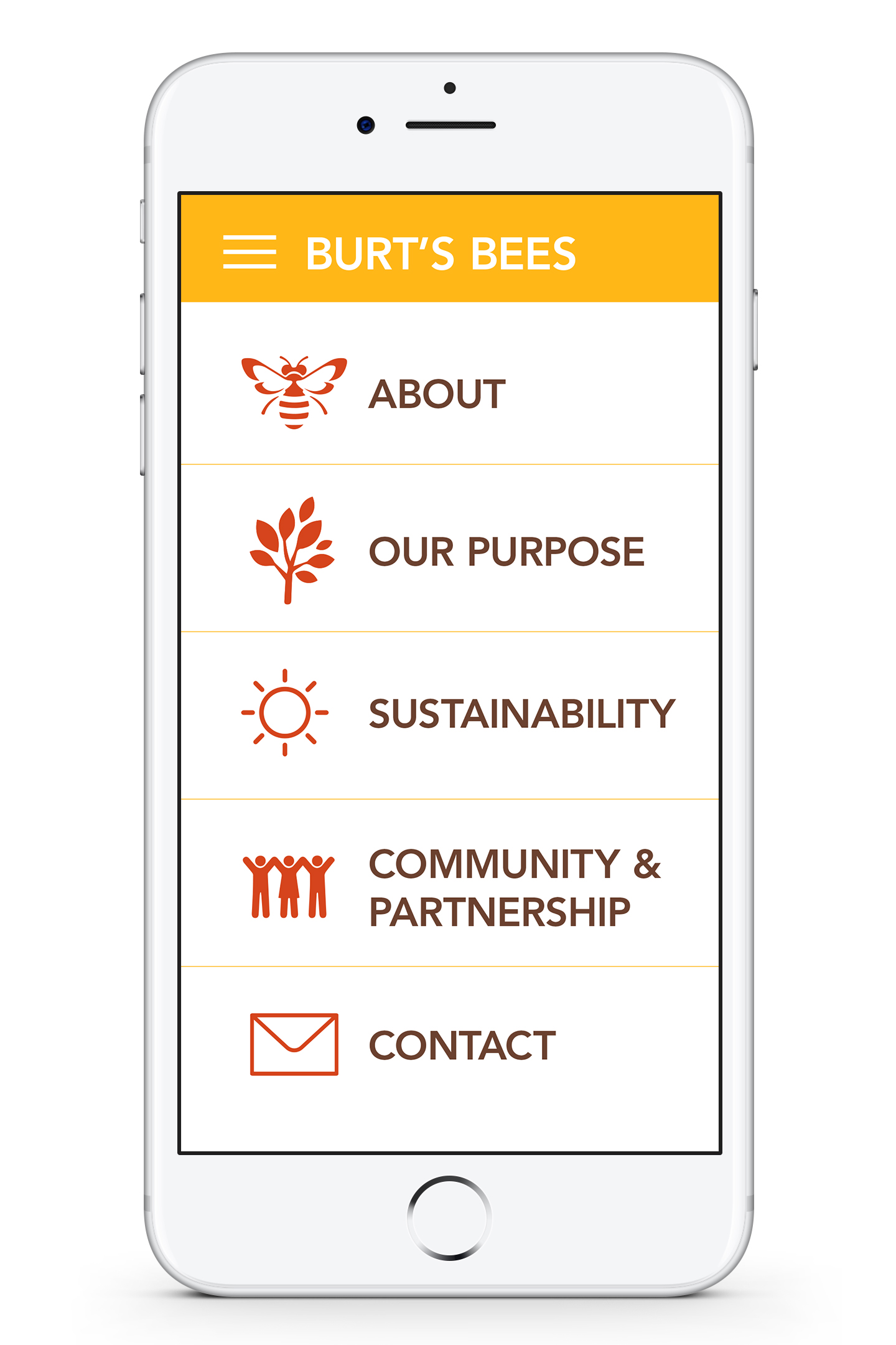
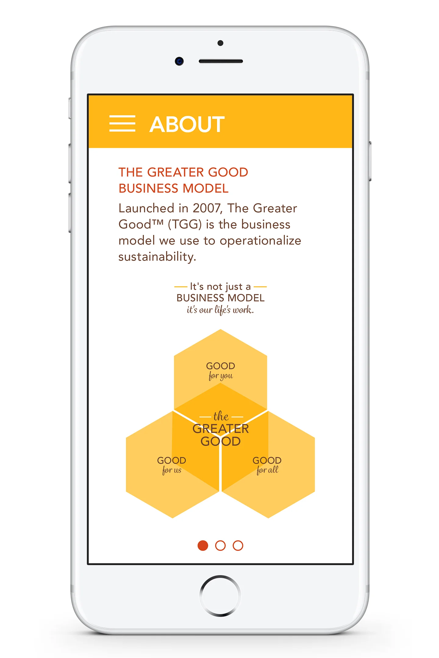
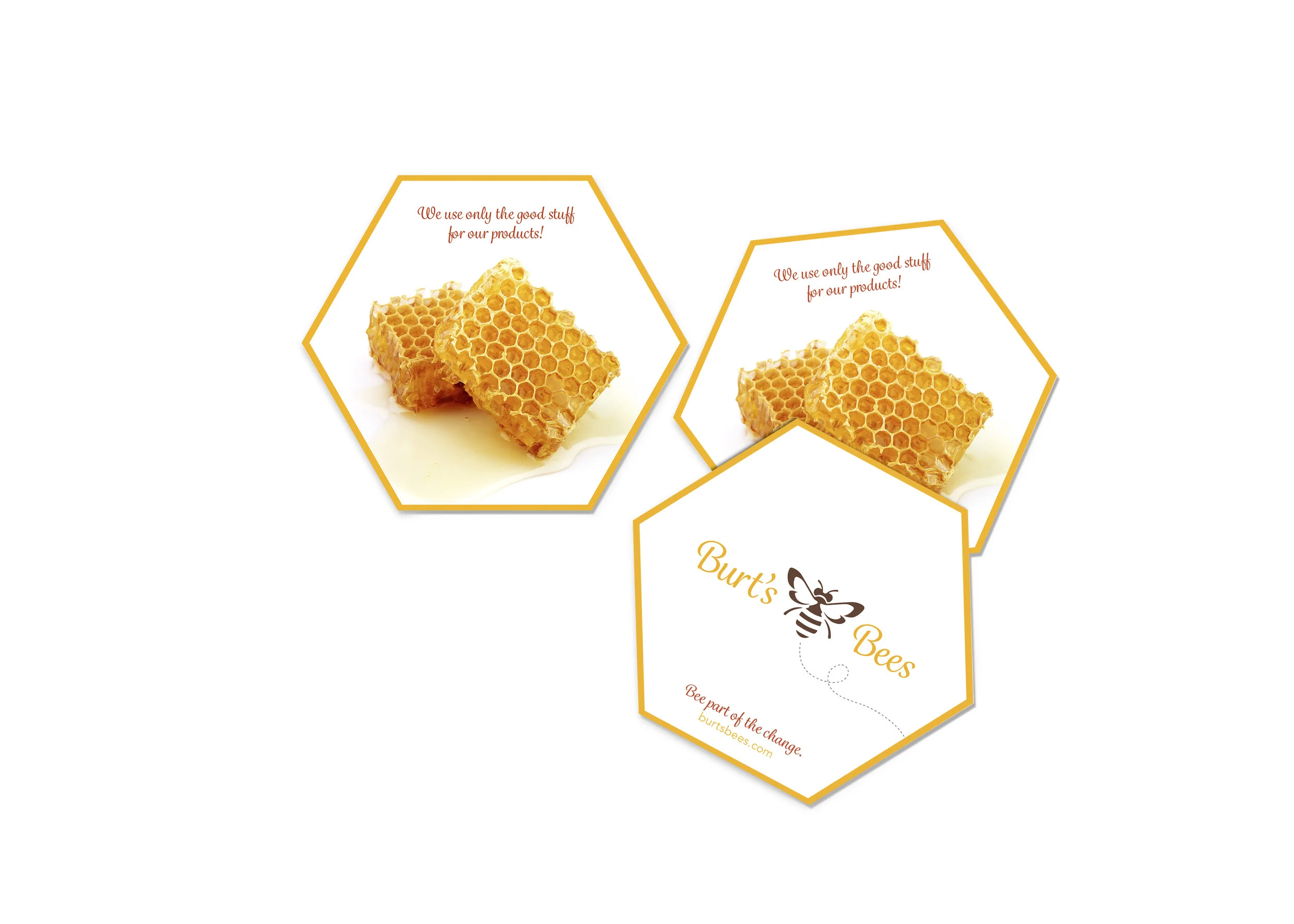
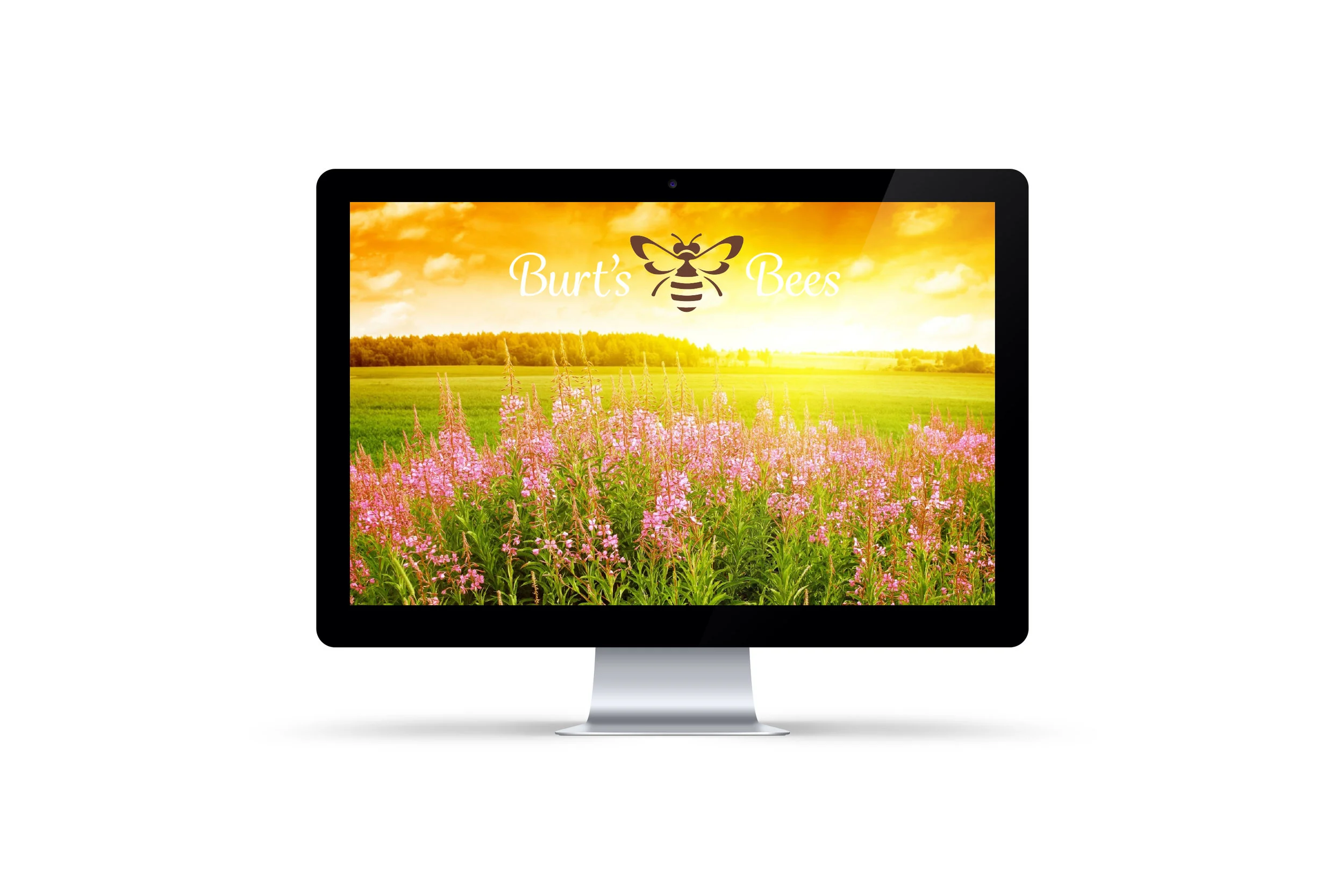
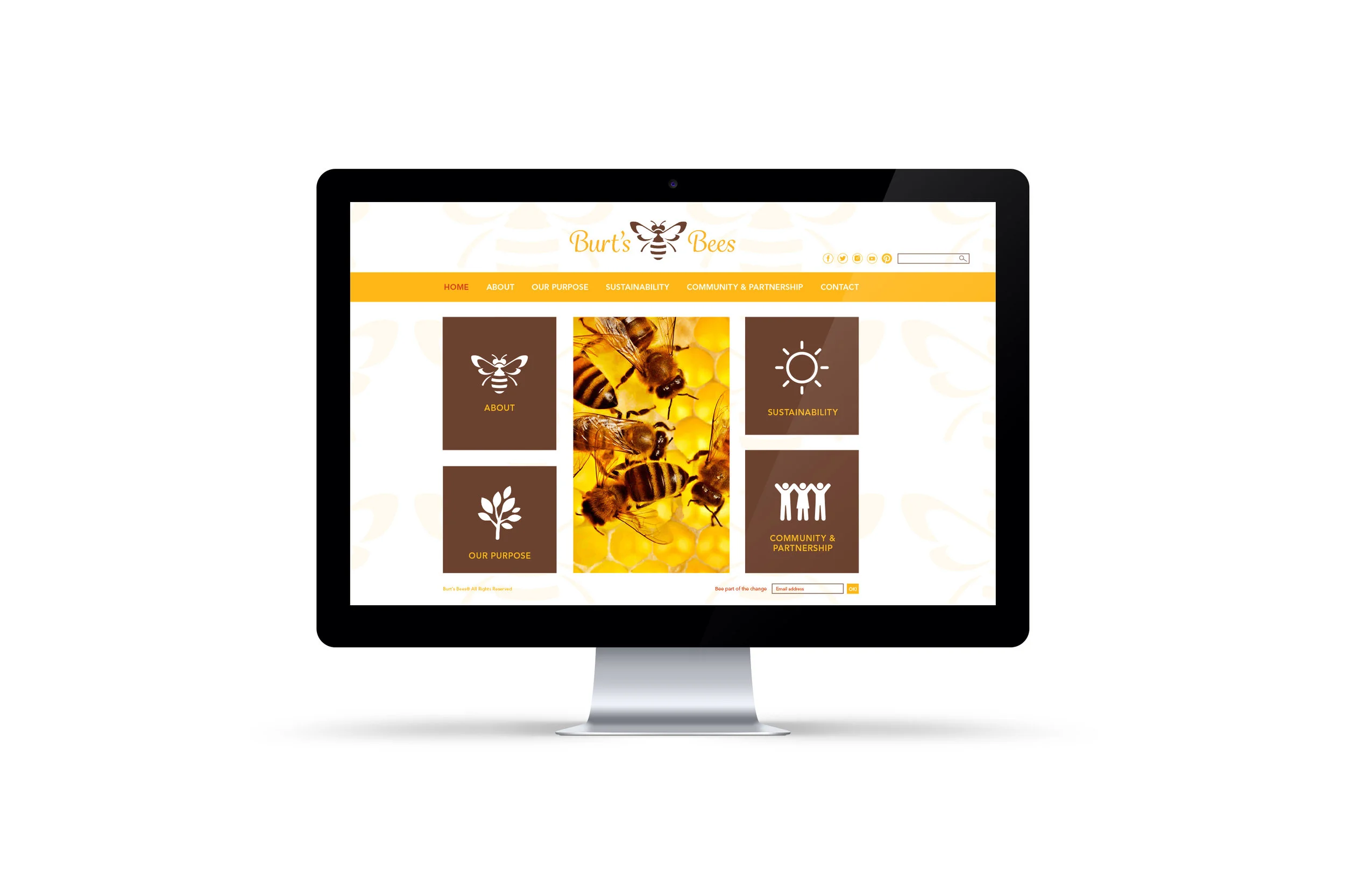
To stay true to the Burt’s Bees brand and the natural elements they pride their company on, I selected yellow, brown, and burnt orange for the color palette and incorporated a variety of images, text, and illustrations in the brochure and website. For social media and the app, I focused on a minimal design that quickly grabs the viewer’s attention since there is such a small window of opportunity to do so.
TYPE OF PROJECT: Corporate Social Responsibility
DISCIPLINE: Branding, Print, Digital
YEAR: Spring 2017